
Introduction to Color Theory
Color theory is a fundamental aspect of design that helps artists and designers understand how colors interact with each other. It provides a framework for creating visually appealing compositions and can significantly enhance the effectiveness of your work. In this article, we will explore the basics of color theory, the color wheel, color harmony, and how to effectively use colors in your designs.
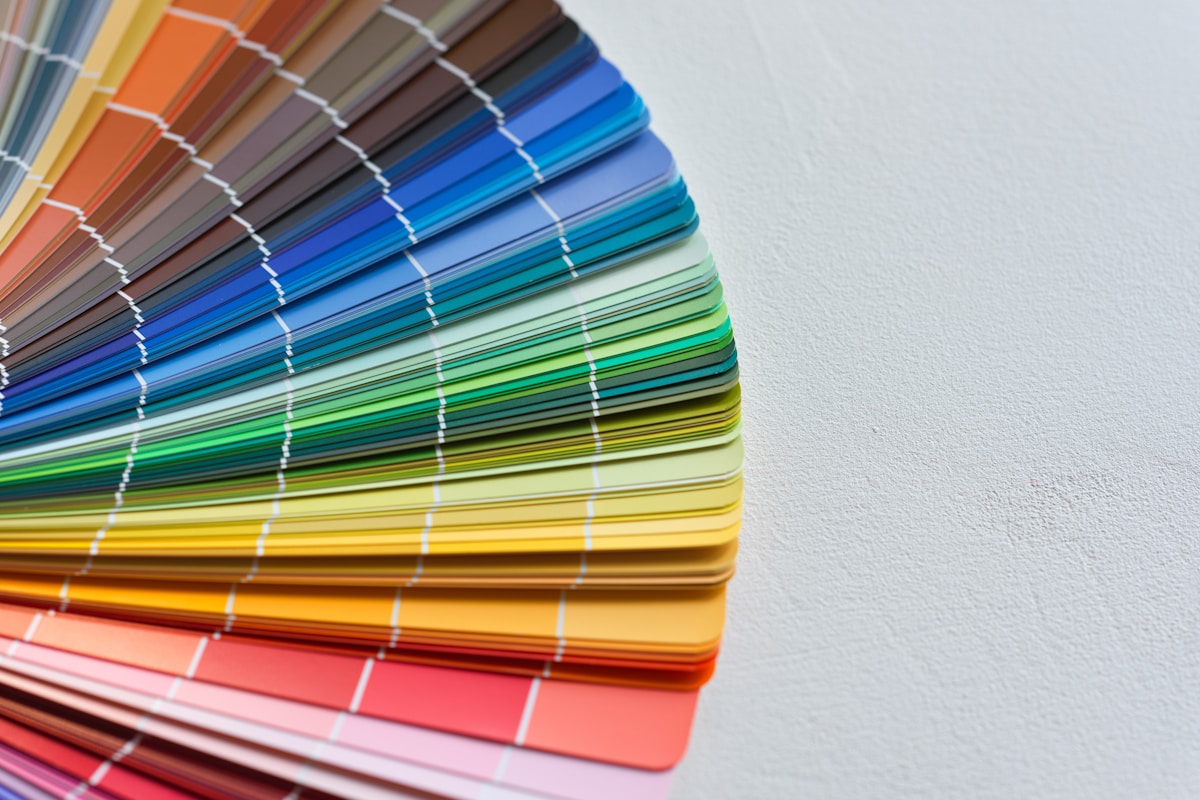
Understanding the Color Wheel
The color wheel is a circular diagram that represents the relationships between different colors. It is an essential tool for designers and artists to visualize color relationships and combinations. The color wheel consists of three primary categories:
1. Primary Colors
- Red
- Blue
- Yellow
These colors cannot be created by mixing other colors and serve as the foundation for creating all other colors.
2. Secondary Colors
- Green (Blue + Yellow)
- Orange (Red + Yellow)
- Purple (Red + Blue)
Secondary colors are formed by mixing two primary colors.
3. Tertiary Colors
- Red-Orange
- Yellow-Orange
- Yellow-Green
- Blue-Green
- Blue-Purple
- Red-Purple
Tertiary colors are created by mixing a primary color with a secondary color, resulting in six additional hues.
Color Harmonies
Color harmony refers to the pleasing arrangement of colors in a design. Understanding different color harmonies can help you create visually appealing compositions. Here are some common types of color harmonies:
1. Complementary Colors
Complementary colors are located directly opposite each other on the color wheel. When used together, they create high contrast and vibrant visuals. Examples include:
- Red and Green
- Blue and Orange
- Yellow and Purple
2. Analogous Colors
Analogous colors are next to each other on the color wheel. They create a harmonious and serene effect. Examples include:
- Blue, Blue-Green, and Green
- Red, Red-Orange, and Orange
3. Triadic Colors
Triadic color schemes consist of three colors that are evenly spaced around the color wheel. This creates balance and vibrancy. Examples include:
- Red, Yellow, and Blue
- Green, Orange, and Purple
4. Split-Complementary Colors
This scheme uses one base color and the two colors adjacent to its complementary color. It offers high contrast while maintaining harmony. For example:
- Base Color: Blue
- Complementary Colors: Red-Orange and Yellow-Orange
The Psychology of Color
Colors evoke emotions and can influence perceptions. Understanding the psychology of color can help you choose the right colors for your designs:
- Red: Passion, energy, and urgency
- Blue: Trust, calmness, and professionalism
- Yellow: Happiness, optimism, and warmth
- Green: Nature, growth, and health
- Purple: Luxury, creativity, and wisdom
- Black: Elegance, sophistication, and mystery
- White: Purity, simplicity, and cleanliness
Tips for Using Colors in Your Designs
To effectively use colors in your designs, consider the following tips:
- Limit Your Color Palette: Too many colors can overwhelm your audience. Stick to a limited palette to maintain focus.
- Use Contrast Wisely: High contrast can draw attention, but too much can be jarring. Find a balance that enhances readability.
- Consider the Audience: Different cultures may interpret colors differently. Tailor your color choices to resonate with your target audience.
- Test Your Combinations: Use design tools or mockups to visualize how your color combinations work in practice.
- Stay Consistent: Consistency in color usage helps build brand recognition and creates a cohesive look.
Conclusion
Mastering color theory is essential for creating stunning visuals that effectively communicate your message. By understanding the color wheel, exploring different color harmonies, and considering the psychology of color, you can elevate your design projects. Remember to experiment and refine your color choices to achieve the best results. Happy designing!